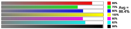
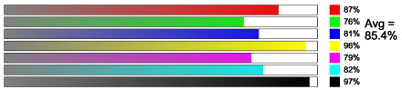
Measured gamut, various media choices
We've scanned test prints of each of our available print types and measured how close we can get to seven out-of-gamut colors: perfect red, green, blue, yellow, magenta, cyan and black. Those who are technically minded will recognize that the absolute numbers don't mean very much -- the results depend not only on the characteristics of the prints, but just as much on the characteristics of the scanner that is used to make the measurements. Moreover, there are a lot of things that go into the program used to do the analysis that can be argued one way or the other. However, the relative gamuts are meaningful, and here they are for the media choices we offer.
We were surprised by the results. We expected to see more variation between the various medias. According to our scanner, there's not as much overall difference between the various media choices as one might expect, based on eyeball perceptions. Blacks, in particular, may be seen diffrently by the eye than by our scanner inasmuch as our scanner's illumination hardware is close to ideal, and prints viewed by eye may appear better or worse, depending on the method of illumination. To our eyes, the glossy and premium matte prints appear to have the deepest blacks. Yet, the scanner sees them very close to the other media types.

satin. 9 mils thick.
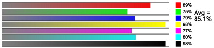
Premium matte. 21 mils thick
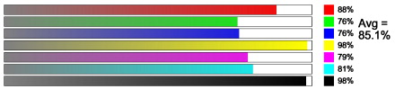
Canvas. 21 mils thick